


Keepit is known for delivering a certain quality of User Experience (UX), which is reflected in customer feedback examples, such as:
‘Keepit’s user-friendliness is a financial win-win’ and ‘I like to call Keepit a Steady Eddie. I know it’s working; I know it’s running, and I don’t have to sweat it.’.
Behind Keepit’s simple design and ease of use lies a deliberate approach, rooted in the idea that our whole system, from the deepest backend layers to the user interface, is built to support a solid User Experience.
However, in the software field, UX has been interpreted in various ways and caused confusion in how it differs from User Interface Design. So, what is UX to Keepit? And how does Keepit go about all this in practicality?
Foundation
UX goes beyond the immediate visual impression and beyond isolated interactions within the product. It is a silent ambassador that ensures a seamless experience throughout any touchpoint. A journey sprinkled with an undefined X factor that leaves our user with instant recognition without the need for explanation -a quality that flows through every vein of Keepit.
An experience starts before the product is even used by our customers. As Don Norman, the inventor of UX, puts it, ‘No product is an island […] It is a cohesive, integrated set of experiences […] Make them all work together seamlessly.’
Leveled circulation
On both conscious and unconscious levels, a human experience is perceived and processed as a sum of different events. The more you know about people, the better experience you will be able to design. To translate such a complex sum into a consistent Keepit experience, we use our Design System as a single documented source.
Here all Keepers will find Design Principles, components, guidelines, patterns, and themes. However, the UX circulates on more levels. To grasp this in a software context, mapping out different levels of the experience can help.
Interaction level
On this level, we work with both look and feel when interacting with the product, from visual design to Information Architecture to navigation. The focus is to design the experience of a certain interaction that a user has with Keepit to perform a task, such as restoring data in Keepit’s application.
However, a user interaction can also exist outside the product interface. One example is receiving support. Each of these interactions are single strokes of experiences that play a role in the relationship with our customer.
On the interaction level, our Design Principles, guidelines, and patterns play a central role. We operationalize this with a pyramid logic in layers, with a theme on the top level and dos and don’ts on the bottom level. Here is an example:
Design Principle: Keepit Sets Me Free
- What users should feel: In every interaction, I as a user should feel the freedom of being in control. This means being offered the most relevant choices at the right time. The choices should lower my cognitive load so that I feel enabled to effortlessly succeed at my tasks.
- Examples of what users should think: ‘I control the situation’ – ‘This is unbelievably easy’- ‘Keepit makes me better at my job’- ‘I get what I need when I need it’
- Examples of what users should see: Recognizable patterns – An easy first entry to the system – Understandable language
- What designers should do: Always give feedback – Build a strong visual hierarchy – Know and understand the user – Always remember what problem we are solving for the user
- What designers should not do: Don’t make the user wait, don’t speak in system language, don’t overload the user with information
Journey level
Zooming into the journey level, we recognize that putting UX first is not isolated in the product interaction itself. The key word here is ‘journey’. Mapping out journeys enables us to discover user needs and pain points, in the quest of providing seamless and consistent experiences across Keepit’s channels.
There are methods to identify key needs and transform them into design challenges. Apart from organized methods, such as usability tests, analytics, and organized customer interviews, there are also more organic user dialogues. From support, through live events, from sales, and so on. In all these touchpoints there are chances to identify key user needs and discover how the Keepit product can solve real user problems.
The key point here is to identify where the needs and pain points are rooted; define the root problem and translate this into design challenges. Further down the road, when ideating on design solutions, the user experience should be consistent in every chosen design solution. Again, this is where the User Experience pyramid, with its design principles at the top, plays its role as a foundation for the other experience levels.
A level connecting the dots
This means that UX is related to the spirit of Keepit, across the whole company. Throughout the different areas of expertise of Keepit, UX connects the dots and remembers to keep the users’ needs at the core of what we do: to deliver simple and safe backup solutions that can set our customers free from the worries of losing data. Keepit’s UX delivers this X factor in its tone of voice, the product’s look and feel, user touchpoints, and customer dialogues.
Keepit’s UX goal is to deliver a consistent heartbeat of look and feel throughout the user journey, anytime, anywhere – pumping it through Keepit’s veins.
UX metrics
As designers, we recognize the challenge in measuring UX, since we are dealing with human behavior and attitude. Here we use deliberate approaches such as confirmation bias. When working on improvements to Keepit’s UX, our main goal is to gather insight, combined with quantitative results.
We want to understand the context and situation that the user is in when encountering Keepit, as well as how this context affects the user.
We also want to know what works, what doesn’t, and why. These insights are gathered through activities such as user interviews and observations. The outcome should be an understanding of user values, supported by quantitative data on average numbers or rates. Additionally, usability metrics give value to the work of measuring. Our different approaches have the common mission of delivering an excellent User Experience, based on data-informed decisions.


 The Keepit Approach to the Five Quality Components of Usability
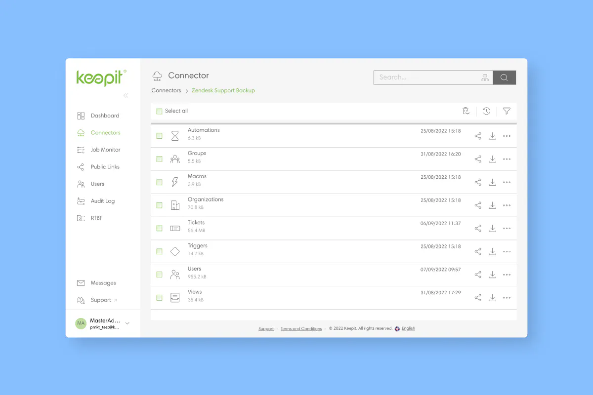
One prominent aspect of Keepit’s cloud backup and recovery solution that customers rave about most is its simplicity and ease of use. Where other similar solutions often require weeks of training, the Keepit solution is plug and play, capable of being implemented and fully operational within minutes – and by everyone on the team. No extensive courses and diplomas are required.
The intuitive ease with which Keepit locates and restores files also means our customers are actively incorporating it into their day-to-day internal support operations, rather than just using it for finding and recovering files that have simply gone astray. The ease of use comes from a dedicated design process, which puts usability up front and users in the driver’s seat.
There are many different opinions on what the word usability means, so here at Keepit — as with many other things — we are inspired by what we observe in the workplace and then have our take on it that fits our product.
The Keepit Design Hierarchy
Creating and following a design hierarchy goes to the heart of how we build and continue to improve Keepit’s backup solution.
For every design and feature we implement, Keepit follows a clear usability vision that strongly focuses on following a design code.
The hierarchy in which we make design and usability decisions is built around Principles, Pillars, and Patterns.
Starting with our Design Principles, everything we do is based on these principles: They are abstractions of how we design our products and help designers make the right decisions.
Design Pillars are more focused on how we implement designs and how the user should experience the Keepit solution. Pillar example: “The right functionality, at the right time, to the right person.” This Pillar is used rigorously for each feature we create throughout the entire user flow.
Is this the right functionality being presented to the user?
Is this the right time to show this functionality?
Will it work for the person who is going to use it?
Finally, we have Patterns.
Design Patterns are specific implementations of functionality. This could be how we implement breadcrumbs, how we handle truncation, checkboxes, dropdowns, and wizards, just to name a few.
Defining Usability
Usability is a quality attribute that assesses how easy user interfaces are to use. The word ‘usability’ also refers to methods for improving ease of use during the design process.
The most popular definition of Usability has five components, as explained by the
Learnability: How easy is it for users to accomplish basic tasks the first time they encounter the design?
Efficiency: Once users have learned the design, how quickly can they perform tasks?
Memorability: When users return to the design after a period of not using it, how easily can they re-establish proficiency?
Errors: How many errors do users make, how severe are these errors, and how easily can they recover from the errors?
Satisfaction: How enjoyable is it to use the design?
There are many other important quality attributes, one of which is utility, which refers to the design’s functionality. In other words, does it do what users need?
How Keepit Measures Usability
Learnability in Keepit:
Let us look at the first item: Learnability. The nature of a backup application is not something our users check in to merely to “get a dopamine kick” from watching cool facts about their running backups. Instead, backup is more “set it and forget it,” and usually, our users come to the platform for one of two reasons. One, is to make sure that everything is running as it should. Two, is to restore data that was lost.
For many of our users, the fact that the application is so easy to learn and understand saves them much time, money, and the frustration of being unable to find the data that needs to be restored.
Memorability in Keepit:
Our approach is not just that things should be easy to learn but also that they must be easy to get back into after being away for a period of time. We do this with a consistent system: most things work in a predictable, similar way, following the same ideas. This increases the chance that something is memorable and easy to re-learn. There are, of course, many things we do to improve the memorability of Keepit, with consistency and recognizability of the applications they are backing up being just some of them.
Efficiency in Keepit:
All of this leads to Keepit’s Efficiency. We like to look at efficiency from the point of view that you should “take the time to look before you jump.” This means we do not consider “few clicks” a success criterion in itself, but rather, we consider “carefully placed” clicks as a step in the right direction – i.e., solving the problem with just the right number of clicks.
Errors in Keepit:
Naturally, we do everything within our power to ensure the number of mistakes made in relation to the task being solved is at a minimum and that a tight correlation exists between the number of errors the user is making and the solution’s efficiency. Every time the user makes an error, it sends them back into the flow, and they will have to redo actions, which again leads to an ineffective solution. Learnability and memorability directly impact the user’s errors, so everything is connected, as you can see.
Satisfaction in Keepit:
Finally, there is one more thing to address: satisfaction. Satisfaction is a tricky topic to discuss when talking about a solution that’s practical in nature and does not contain any real incentive to be a pleasurable experience. In the Keepit design, we have gone to great lengths to fight against the tendency of “functional design” that flourishes in the world of IT management tools. Instead, we have moved toward the concept of “emotional design” because IT administrators also deserve good tools.
In functional design, where the idea that showing everything all at once means more control and empowered admins, Keepit believes showing the right thing, at the right time, to the right person offers the ultimate degree of control and empowerment. We also believe that creating a pleasurable and satisfying experience with administration tools like Keepit, where everything “just works,” frees up administrators to focus on other priorities.
Final Thoughts
Despite our mission to create the perfect solution that requires no previous knowledge to recover data, we are painfully aware that achieving perfect usability is a goal yet to be reached. But we strive every day to get there.
That said, we recommend that our users regularly make sure they understand the flows and the emergency training so that in the case of an emergency, they know exactly what to do and when to do it, which we’ll save for a future blog post.
At Keepit, we put a lot of effort into ensuring that the design leaves little room for mistakes and is easy to pick up again after a long vacation – even for an inexperienced administrator.
Help The Keepit Design Team
We are always looking for people who would like to provide feedback on our solution and help us create the best design in the world. Please if you are interested in becoming part of the user feedback forum.
The Keepit Approach to the Five Quality Components of Usability
One prominent aspect of Keepit’s cloud backup and recovery solution that customers rave about most is its simplicity and ease of use. Where other similar solutions often require weeks of training, the Keepit solution is plug and play, capable of being implemented and fully operational within minutes – and by everyone on the team. No extensive courses and diplomas are required.
The intuitive ease with which Keepit locates and restores files also means our customers are actively incorporating it into their day-to-day internal support operations, rather than just using it for finding and recovering files that have simply gone astray. The ease of use comes from a dedicated design process, which puts usability up front and users in the driver’s seat.
There are many different opinions on what the word usability means, so here at Keepit — as with many other things — we are inspired by what we observe in the workplace and then have our take on it that fits our product.
The Keepit Design Hierarchy
Creating and following a design hierarchy goes to the heart of how we build and continue to improve Keepit’s backup solution.
For every design and feature we implement, Keepit follows a clear usability vision that strongly focuses on following a design code.
The hierarchy in which we make design and usability decisions is built around Principles, Pillars, and Patterns.
Starting with our Design Principles, everything we do is based on these principles: They are abstractions of how we design our products and help designers make the right decisions.
Design Pillars are more focused on how we implement designs and how the user should experience the Keepit solution. Pillar example: “The right functionality, at the right time, to the right person.” This Pillar is used rigorously for each feature we create throughout the entire user flow.
Is this the right functionality being presented to the user?
Is this the right time to show this functionality?
Will it work for the person who is going to use it?
Finally, we have Patterns.
Design Patterns are specific implementations of functionality. This could be how we implement breadcrumbs, how we handle truncation, checkboxes, dropdowns, and wizards, just to name a few.
Defining Usability
Usability is a quality attribute that assesses how easy user interfaces are to use. The word ‘usability’ also refers to methods for improving ease of use during the design process.
The most popular definition of Usability has five components, as explained by the
Learnability: How easy is it for users to accomplish basic tasks the first time they encounter the design?
Efficiency: Once users have learned the design, how quickly can they perform tasks?
Memorability: When users return to the design after a period of not using it, how easily can they re-establish proficiency?
Errors: How many errors do users make, how severe are these errors, and how easily can they recover from the errors?
Satisfaction: How enjoyable is it to use the design?
There are many other important quality attributes, one of which is utility, which refers to the design’s functionality. In other words, does it do what users need?
How Keepit Measures Usability
Learnability in Keepit:
Let us look at the first item: Learnability. The nature of a backup application is not something our users check in to merely to “get a dopamine kick” from watching cool facts about their running backups. Instead, backup is more “set it and forget it,” and usually, our users come to the platform for one of two reasons. One, is to make sure that everything is running as it should. Two, is to restore data that was lost.
For many of our users, the fact that the application is so easy to learn and understand saves them much time, money, and the frustration of being unable to find the data that needs to be restored.
Memorability in Keepit:
Our approach is not just that things should be easy to learn but also that they must be easy to get back into after being away for a period of time. We do this with a consistent system: most things work in a predictable, similar way, following the same ideas. This increases the chance that something is memorable and easy to re-learn. There are, of course, many things we do to improve the memorability of Keepit, with consistency and recognizability of the applications they are backing up being just some of them.
Efficiency in Keepit:
All of this leads to Keepit’s Efficiency. We like to look at efficiency from the point of view that you should “take the time to look before you jump.” This means we do not consider “few clicks” a success criterion in itself, but rather, we consider “carefully placed” clicks as a step in the right direction – i.e., solving the problem with just the right number of clicks.
Errors in Keepit:
Naturally, we do everything within our power to ensure the number of mistakes made in relation to the task being solved is at a minimum and that a tight correlation exists between the number of errors the user is making and the solution’s efficiency. Every time the user makes an error, it sends them back into the flow, and they will have to redo actions, which again leads to an ineffective solution. Learnability and memorability directly impact the user’s errors, so everything is connected, as you can see.
Satisfaction in Keepit:
Finally, there is one more thing to address: satisfaction. Satisfaction is a tricky topic to discuss when talking about a solution that’s practical in nature and does not contain any real incentive to be a pleasurable experience. In the Keepit design, we have gone to great lengths to fight against the tendency of “functional design” that flourishes in the world of IT management tools. Instead, we have moved toward the concept of “emotional design” because IT administrators also deserve good tools.
In functional design, where the idea that showing everything all at once means more control and empowered admins, Keepit believes showing the right thing, at the right time, to the right person offers the ultimate degree of control and empowerment. We also believe that creating a pleasurable and satisfying experience with administration tools like Keepit, where everything “just works,” frees up administrators to focus on other priorities.
Final Thoughts
Despite our mission to create the perfect solution that requires no previous knowledge to recover data, we are painfully aware that achieving perfect usability is a goal yet to be reached. But we strive every day to get there.
That said, we recommend that our users regularly make sure they understand the flows and the emergency training so that in the case of an emergency, they know exactly what to do and when to do it, which we’ll save for a future blog post.
At Keepit, we put a lot of effort into ensuring that the design leaves little room for mistakes and is easy to pick up again after a long vacation – even for an inexperienced administrator.
Help The Keepit Design Team
We are always looking for people who would like to provide feedback on our solution and help us create the best design in the world. Please if you are interested in becoming part of the user feedback forum. 
 Source: